
Film 4 is a Film production company famous for film such as 'The Inbetweeners Movie' and 'How To Lose Friends And Alienate People'. There production logo is a very simple color scheme and design but it show the idea of the company using only three simple lines and the word film (simple but effective.
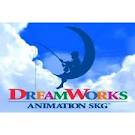
Dreamworks is another production company logo i have looked at unlike film 4 this logo is alot more intricate it uses alot of different colour schemes as well as an actual picture and background to achieve publicity and effect it also has alot more animation involved in it (gives the impression that the company has more time and money, etc).

 20th century fox is another film company that sports a very 'intricate' production logo as well as a very imposing title from these titles we are beginning to see a pattern most of the ones that we can remember from just viewing the image are the bigger companies that have more imposing titles, serious animatics and a backing track to there logo.
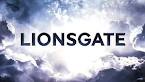 Lionsgate is a very simplistic design logo it however has animatic in the sense that a cloud movement as well as the title getting bigger and bigger this one i feel has a more eerie and darkened appearance and has elements that could be incorporated into our production company logo.
 Metro Goldwyn Mayer shows vintage film production logo animation (the tiger roaring is shown in a very old film picture style fuzziness and muffled sound etc) this one also shows simplicity in the fact that apart from the lion no animation is present in the sequence and the logo literally just fades in and then fades out. (a good, simple and effective method to show our logo).
Spyglass like paramount and dreamworks is another production logo that incorporates a lot of animation, sound, color and placement to achieve a very high grade production company logo that gets it's point across that this logo is a high grade film production company logo.


Going back to simplistic design is the company of PATHE! which use a very simple wire model to achieve the affect of animation in there logo they however use more intricate lighting and 'real' objects instead of CGI rendering an example being that they use shadow to further show the logo.

Universals logo is by far the most intricate and interesting of all of the logo's in my opinion because it features the entire earth lighting up and links well with the title because of this people know about this title because it is distinct and is a one off production company logo. Like most of these production logo's it also features a backing track.
No comments:
Post a Comment