Frame 1: 3 seconds on CU of eyes, from forehead to nose of guy
Movement of camera: the camera pans down and pivots left, revealing a knife in the mans hand, continues on panning down to the floor while going left as well, and then pans upwards to reveal a close-midshot of a man slumped against a wall with blood on his top.
Length: 12 seconds - 3 seconds on face at begging, the rest is movements
Frame 2: half a second of a midshot with the guy dropping his knife on the floor. his positioned in the middle of the frame.
Movement of camera: none
Length: half a second.
Frame 3: Low shot of foot on the right of the screen, with the knife falling in the middle of the shot.
Movement of camera: none
Length: 1 second
Frame 4: Over the head shot high angle of the dead person against wall, you can see the back of the mans head, and shoulders, he nervously looks around the cubicle wall
Movement of camera: none
Length: 1 + half seconds
Frame 5: match on action of the guy looking around the corner, with a reflexion of him in the mirror, and he moves back and walks to have a look in the other toilet
Movement of camera: follows the guy
Length: 3 seconds
Frame 6: high up shot, looking slightly down, from the top of the cubicle of the guy opening the door, looking in then walking away (looking worried)
Movement of camera: still.
Length: 2 seconds
Frame 7: Still camera, midshot of the mirror, the man walks into the frame, you can see the back of his head, he seems to be washing his hands
Movement of camera: still camera
Length: 6 seconds.
--Frame 7a the same frame but there is a jump of someone behind the man in the mirror but its not the same man, its the one being murdered by someone
Frame 7 again: the same shot continuing, the man is still washing his hands, he then looks up immediately, and looks in the mirror, then looks down again... match on action to frame 8.
Frame 8: side shot from the right of him, with sink, he finishes washing his hands and rubs his hands on his face. he then moves back
Movement of camera: still
Length: 4 seconds
Frame 9: high angle shot, looking slightly down on the guy, the guy moves around and looks around nervously
Movement: follows the guy
Length: 5 seconds
Frame 10: mid shot of the guy, looking at him from the right, the guy comes on and glabs his feet ready to drag him
Movement of camera: none
Length: 2 seconds
Frame 11: Low angle of feet from a right view back of foot, you can see the knife in the frame as well, directly behind foot, the man puts the dead persons feet down, kicks the knife backwards out of the frame, and picks the feet up again, and is about to drag the body.
Movement of camera: still
Length: 3 seconds
Frame 12:
Movement of camera
length:
Movement of camera:
Length:
Thursday 24 November 2011
Tuesday 22 November 2011

Tuesday 15 November 2011
Group Meeting - 15/11/11
We were not successful when filming the Dexter opening, as the camera was not working properly. We all take responsibility for the problems we faced. Resulting in this, we received a level 1 grade.
Our action plan is now to check every camera we take out is in working order, and to check that all equipment is working.
We had story boarded it, and collected props but we still needed to find an actor and location, so we still couldn't have filmed it.
Date: Wednesday 15th Nov
Location: School disabled toilets, Nicole's house
Time: 3rd period to discuss at school, after school to shoot at Nicole's
Props needed: fly, fake blood, gammon, orange, floss, shoelaces, plan white tee,
Date: Thursday 16th Nov
Location: Outside Ashleigh's house
Time: 3rd period
Props needed: key, door, somewhere to walk away from door
Closed Door Film Production
after pitching different ideas (such as me, nicole and Ashleigh came up with the idea of calling our company 'Closed Door Film Production' once we had decided on this name we begin to write up sketches on how the animation for the logo could work, what color the animation would be, what font the animation would be below are these sketches of these different animation ideas and how they would 'flow' and how relevant to the film company they are. (see below to look at the photo's)


Friday 11 November 2011
Dexter - Recreating the opening sequence
We were given "Dexter" as our opening sequence which we had to recreate. We were given a camera, tape, tripod and charger and had to remake the opening sequence shot by shot, including every detail that was made in the sequence.
Here is the opening sequence:
Here is the opening sequence:
After watching the sequence, we made a list of frames shot by shot of what we would need to shoot.
Here is our list of shots we would have to take to complete this sequence:
- Man laying down with arm out - mosquito on arm (XCU)
- Arm - mosquito (CU)
- Splat, focus changes from mosquito to face of man.
- DEXTER credits in orange/red, cream/burnt edges background. Blood splatter
- Over shoulder back of a mans head, blurred face back of head in focus
- finger rubbing stubble, close up
- CU of shaving neck area
- Neck shot, blood dripping down
- basin plug, blood splat, 2 drops jump in between.
- CU of neck, hand comes in and tissue absorbs blood
- tissue absorbs blood (CU of tissue)
- Carving meat, cutting through the plastic
- Slicing gammon up
- Bending gammon
- Square of gammon
- Frying pan with butter in it
- A - chucks B - stabs meat and picks up
- CU of nose and eyes jumps to ....
- Mouth - shoves food in. chews
- Breaks egg, on the side
- Egg in pan, (pans)
- Screwing yolk around the pan
- Ketchup splats, egg CU, fork and knife, spurts ketchup across plate
- Scraps egg with knife and folk, comes in ketchup on knife
- Coffee ground up
- Grips handle of coffee filter
- Presses handle down
- Bubbles of the bottom of the coffee machine
- Orange being slowly sliced in half, red background, zig zag in and out
- XCU of cutting orange
- Squeezing orange, 3 shots pressing down, squishing orange till empty
- Orange, different focus on orange but CU
- Floss wrapping around finger, cross fades, jumps to, holds it
- Sink brings hands up to neck, floss in mouth
- Shoe laces fist pulling them tight
- Arms, see just the edge of a lace being folded but not on camera,
- Shoe lace goes through eyelit of shoe
- Pulls tight
- Pulls laces up
- Pulls shirt over face really pulling it over his face to see his outline of his face
- CU pulls down
- Looks into camera for 5 seconds
- Pulls key from outside door out
- Walks, turns his head a bit to the camera, smiles, "ting" his head turns facing forward.
Thursday 10 November 2011
Collage of our Target Audience (of our film)
This is a collage that was made to show you what our target audience would be for our film:


Our collage shows that this could be targeted at either genders as it has recognisable female actresses and some recognisable actors.
Friday 4 November 2011
Audience Research Statistics
Below are some statistics for different films, and a small analysis of why the statistics are like the way they are.
 As you can see from the stats, the most popular age group that have rated the movie are 18-29 year olds. Although the rating of the movie is 15, this doesn't mean the audience will be 15 year olds, it just means that the film is suitable for anyone aged 15 years or older. The stats from Shutter Island suggest that the target audience for the movie is 18-29 year olds.
Also, the gender shows that more men have rated the movie than women. This could be because men are more likely to rate films on the internet than women, but also that more men like the film, or have an interest in thrillers.
Here is the link to the official trailer: http://www.youtube.com/watch?v=5iaYLCiq5RM
The main characters in this film are men, aged around 30 years old. This reflects the gender of the audience because men may want to watch the film as it looks scary, or the lead actor of Leonardo DiCaprio might be a male role model to them. A reason for women to like the film may be because of Leonardo DiCaprio being rather good looking, or they may just enjoy the genre.
 From the statistics off the IMDB website, we can see that the gender that rated the movie the most is Males. And the target audience for this movie is people aged 18-29 years old. This age range could be commonly popular because it is the young adults who have spare time and who would go to the cinemas to see the movies. They might also be the most popular because this age range is known for being popular and frequent internet users.
Here is the trailer for The Dark Knight: http://www.youtube.com/watch?v=yQ5U8suTUw0
This is very popular with males as the lead character is a male, and men can look up to this hero figure.

This is one of the top rated thriller films on the IMBD website. The gender rating is also mostly men. And the age range that is the highest is also 18-29 year olds. This is the same for all 3 movies i have researched, and shows the same trend that most thrillers are liked more by men, and people who are aged 18-29 years old.
Here is the link for The Silence of the Lambs trailer: http://www.youtube.com/watch?v=lQKs169Sl0I
In this film one of the main characters is female, this may slightly change the audience who watch the film, and whether there are more females, or more male watchers in the audience.
 Pulp Fiction
This film, from stats would show that the majority of people who have rated the film are male, and aged from 18-29 years old. For the same reasons as listed above in previous analysis, this could be because some males spend more time on the internet than females. It can not fully represent who enjoys watching thrillers between women vs men, because maybe not all women have rated the movie on the IMDB website.
Here is the trailer for Pulp Fiction: http://www.youtube.com/watch?v=lDbSbOsoRnY
The ratio between men and women for this movie is bigger than the last movie which suggests that less women like this movie, than the other one, or less women have watched this movie compared to The Silence of the Lambs.
Shutter Island.

Also, the gender shows that more men have rated the movie than women. This could be because men are more likely to rate films on the internet than women, but also that more men like the film, or have an interest in thrillers.
Here is the link to the official trailer: http://www.youtube.com/watch?v=5iaYLCiq5RM
The main characters in this film are men, aged around 30 years old. This reflects the gender of the audience because men may want to watch the film as it looks scary, or the lead actor of Leonardo DiCaprio might be a male role model to them. A reason for women to like the film may be because of Leonardo DiCaprio being rather good looking, or they may just enjoy the genre.
The Dark Knight.

Here is the trailer for The Dark Knight: http://www.youtube.com/watch?v=yQ5U8suTUw0
This is very popular with males as the lead character is a male, and men can look up to this hero figure.
The Silence of the Lambs.

This is one of the top rated thriller films on the IMBD website. The gender rating is also mostly men. And the age range that is the highest is also 18-29 year olds. This is the same for all 3 movies i have researched, and shows the same trend that most thrillers are liked more by men, and people who are aged 18-29 years old.
Here is the link for The Silence of the Lambs trailer: http://www.youtube.com/watch?v=lQKs169Sl0I
In this film one of the main characters is female, this may slightly change the audience who watch the film, and whether there are more females, or more male watchers in the audience.

This film, from stats would show that the majority of people who have rated the film are male, and aged from 18-29 years old. For the same reasons as listed above in previous analysis, this could be because some males spend more time on the internet than females. It can not fully represent who enjoys watching thrillers between women vs men, because maybe not all women have rated the movie on the IMDB website.
Here is the trailer for Pulp Fiction: http://www.youtube.com/watch?v=lDbSbOsoRnY
The ratio between men and women for this movie is bigger than the last movie which suggests that less women like this movie, than the other one, or less women have watched this movie compared to The Silence of the Lambs.
Tuesday 1 November 2011

Existing film production companies

Film 4 is a Film production company famous for film such as 'The Inbetweeners Movie' and 'How To Lose Friends And Alienate People'. There production logo is a very simple color scheme and design but it show the idea of the company using only three simple lines and the word film (simple but effective.
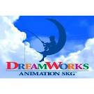
Dreamworks is another production company logo i have looked at unlike film 4 this logo is alot more intricate it uses alot of different colour schemes as well as an actual picture and background to achieve publicity and effect it also has alot more animation involved in it (gives the impression that the company has more time and money, etc).

 20th century fox is another film company that sports a very 'intricate' production logo as well as a very imposing title from these titles we are beginning to see a pattern most of the ones that we can remember from just viewing the image are the bigger companies that have more imposing titles, serious animatics and a backing track to there logo.
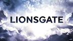 Lionsgate is a very simplistic design logo it however has animatic in the sense that a cloud movement as well as the title getting bigger and bigger this one i feel has a more eerie and darkened appearance and has elements that could be incorporated into our production company logo.
 Metro Goldwyn Mayer shows vintage film production logo animation (the tiger roaring is shown in a very old film picture style fuzziness and muffled sound etc) this one also shows simplicity in the fact that apart from the lion no animation is present in the sequence and the logo literally just fades in and then fades out. (a good, simple and effective method to show our logo).
Spyglass like paramount and dreamworks is another production logo that incorporates a lot of animation, sound, color and placement to achieve a very high grade production company logo that gets it's point across that this logo is a high grade film production company logo.


Going back to simplistic design is the company of PATHE! which use a very simple wire model to achieve the affect of animation in there logo they however use more intricate lighting and 'real' objects instead of CGI rendering an example being that they use shadow to further show the logo.

Universals logo is by far the most intricate and interesting of all of the logo's in my opinion because it features the entire earth lighting up and links well with the title because of this people know about this title because it is distinct and is a one off production company logo. Like most of these production logo's it also features a backing track.
Subscribe to:
Posts (Atom)